


- nyah rylie

- May 15, 2024
- 15 min read
Updated: May 16, 2024
As the social media manager for @cmpwestminster, I was happy to volunteer as the sole member of the 2024 CMP Degree Show publicity team. Following our initial exhibition team meetings, my first step was to design a poster that would establish the branding - colour palette, font type, theme, etc. - for the rest of the CMP degree show specific publicity content.
Designing the Poster
To kickstart brainstorming a design approach, I looked at and documented existing posters currently displayed around campus, as well as previous CMP exhibition posters I participated in designing throughout the year.


Slide Notes: "examples of posters currently displayed around campus for current or upcoming exhibitions
Fine Art course's 'You Deserve To Be A Child' in London Gallery west has a few variations of the main info poster as well as a QR code for an instagram account"
"these are the past posters designed for exhibitions this year
i like to centre the design around an image from one of the pieces of work actually in the exhibition
kinda like a sneak peak of what's to come
and because there's some really strong visuals made by our own students that i'd rather use than stock images or assets"

Slide Notes: "these are the drafts i've created so far using images from content on people's ning blogs
however if you have any other images from your project that you'd like to send me please feel free"
"as you can see i've gone with more earthy tones
the themes that seemed to come up across projects were related to nostalgia, culture, identity, and generally quite personal experiences
i thought a warmer, more homely, organic colour palette would align well with this"


At the whole year meeting, the feedback we received was that most people liked the 2nd and 4th designs. However, the conclusion was that the background of the second one was too cinematic - more akin to a movie poster than an exhibition - and the 4th was more contemporary. It seemed like people hoped for imagery that would incorporate more projects but that was dependent on people actually being cooperative in sending me their images in a timely manner. Unfortunately, we encountered issues with people's access to the OneDrive I'd created so this also contributed to delay in me receiving images so I had people email them directly to me instead.
Logo
Simple, distinct butterfly shape
Stuck around campus as guide to exhibition spaces


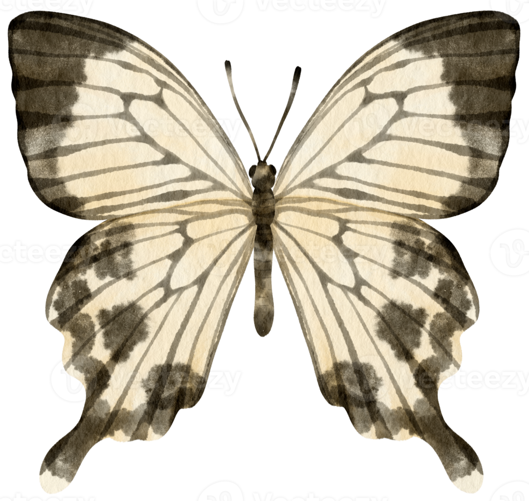


In one of our initial meetings, Julie proposed the idea of having a 'logo' or symbol or colour that would be distinct enough to be associated with our exhibition. Since our degree show would take place at the London Gallery West spaces in Harrow instead of Ambika P3 at Marylebone, this would also serve as a recurring visual guide across the campus to connect the different areas. I also experimented with adapting the butterfly shape to include a QR code that leads to the exhibition guide/maps and other information, to reduce the need for printouts and paper waste.
Finalising the Poster
After waiting on images from people's projects to no avail, I and the curation team decided it was best to simply take my own initiative in the design. I asked them if they had any ideas and Umme sent an AI generated image for reference. It was particularly the butterflies sort of merging with and melting from the face that she liked so I kept this concept in mind.

I wanted to avoid having imagery of a specific person or people so I started by experimenting with images I already had on hand from my own project since we had a 3D rendered character. However, even this was too distinct a likeness to work with and I couldn't figure out how to seamlessly blend the 3D model out into butterflies.
I tried applying effects - inner glow, outer glow, etc. - to the butterfly to make it less realistic and more contemporary, referencing technological advancement, etc. and initially applied the same effect to the character hoping the more solid lines of the glow would allow me to connect them (think android, cyborg, cyber, vaporwave) but I simply lacked the time, patience, and graphic design skills. I also tried applying a stained glass effect that gave the character a more mosaic type texture that was closest to being pixelated, which I thought might allow me to create an effect of individual pixels shattering into butterflies but I also found this approach tedious and lacking sophistication. I was in too much of a rush to finalise this poster design in time for Zak to send it out to the university's marketing team upon their request that I simply didn't have time to learn how to achieve those effects in a more efficient and refined matter.

Fortunately, one of the photos Emerald submitted from her own photography based major project featured her brother which she edited in almost the exact 'shattering' or 'pixelated' effect I was envisioning. I cropped this photo, adjusted saturation, highlights, shadows, contrast, etc. to make it black and white, and then found a png of white butterflies flying to overlay to see if the effect could be achieved with it. This was the draft I presented at the next meeting with Julie, Johnny, Zak, and Chris regarding publicity.


Adjustments made from feedback:
zoomed in/cropped to only feature the head - too cinematic/lead movie character
changed the title font to upper case for a bolder effect
alignment of text
content aware fill/healing brush to patch unnecessary spots making it smoother/polished
add more colour (chose orange to at least keep to warm palette as initially pitched) - found more individual/detailed butterflies e.g. monarch and added a gradient to the white ones to fade more into the orange as they got further from the head
gradient overlay
bottom row butterflies blend mode: colour burn (yellow)
top row butterflies blend mode: linear burn (orange)
blending butterflies into background better (reducing white outline from automatic mask)
remove background > inner shadow > choke
QR code leads to linktree: CMP Instagram, CMP course info page on Westminster site, Exhibition guide

OUR INSTALLATION
With everything going on, the installation design had been more of an afterthought until I'd completed the pressing tasks for the degree show branding and publicity. However, I had always envisioned a set up similar to this 3 projector immersive landscape room in 'REVIVAL: THE VANISHING OF CLOUD FOREST' from last year's CMP degree show, 'Resurgence' in Ambika. I thought this would be a cool and efficient way of recreating one of the video game environments as an immersive installation on an even bigger scale and more refined than that of our previous Convergent Media exhibition in which our first video game was.


I happened to walk into the EMS when M Block Team Leader, Craig Harvey was talking to Connor Turansky and Stanley about the degree show set-up and the availability of the film studios during those weeks. He encouraged us to use the studio spaces for the exhibition as our degree show had been pencilled into the booking for them. The pantographs, lighting, M stores, flats, set design equipment, curtains, etc. in the studios would make for a highlight controlled environment that would enable us to achieve so much more than we could in just the gallery spaces.
After passing the idea onto the exhibition team, speaking to technicians, and touring it with the 'Nuclear Waves' project group, it was decided that only our group would be using Studio 2 to exhibit our project. This meant that the possibilities had significantly opened up and I had a lot of planning to do to make the most of space.


My initial idea was to divide the space into two sections representing the start and end of the game:
a recreation of my childhood bedroom as an exhibition of photographs of all the real life people, places, and objects that inspired the game + a screen showing a playthrough video of the game so people could get an idea of it if they didn't have a chance to play
a recreation of the meadow scene with a computer in the middle to play the game
However, in our last crit with Tadej, he pointed out that this might be too literal and convoluted and recommended sticking to just one "room" space to streamline the experience and make it more immersive. So I returned to the original idea on a larger scale but with an actual canopy bed in the middle. For this, I discussed the possibility of building a bed frame with Liam Biswell from the 3D Workshop and Rish Parekh (who used to work in the 3D workshop but now works as an M Block technician). I came to Liam with an initial sketch of the bed frame design I had in mind to gage whether it would be possible and then sent an email following up later after further research.
The logistics involved in designing and building even a bed frame for only an exhibition took a lot more effort than anticipated. I found countless existing bed frames, searched several secondhand sites, and compared international measurements of double mattresses. I even found a bed frame being sold on a website with a built in AR feature that let me visualise it in a room with my camera. Unfortunately, I was working in a Starbucks so this was virtually useless to me.


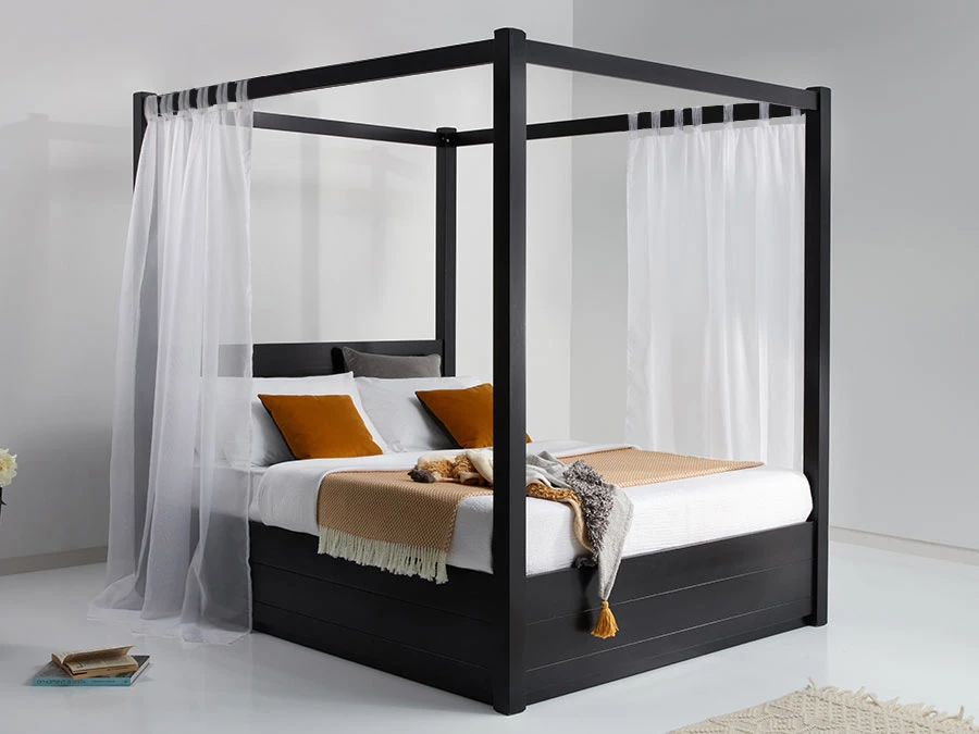
I wasn't sure how much larger if at all a bed frame might have to be in comparison to the mattress but I am looking to use a standard double mattress that is 135x190cm. I also collected reference photos of existing bed frames that might be closest to what I was imagining but I'm hoping to make it as simplified as possible so it's not too much trouble to make.
As for the mattress, I originally hoped to find cheap alternatives on Freecycle, Facebook marketplace, or Gumtree but I couldn't find any second hand bed frames that were close enough that they would be easy to add onto so we have decided to build from scratch based around a double mattress. I'm thinking it would be easiest to have the mattress quite low down or practically on the ground with a slightly raised platform so it won't have to support too much weight. However, we have also looked into the possibility of getting an 11cm thick 135x190cm memory foam mattress topper since it's intended for an exhibition and not going to be used for actual sleeping or anything, it would be easier to store and transport. The only thing is since a mattress topper is significantly thinner, it may need to be off the ground to be at a suitable height to resemble a bed.
Preparing for set-up week
Monday 29/04
(11 days till Metamorphosis)
There have been major changes to our plans for the bed frame since I've been in contact with M Block technician, Rish and 3D Workshop technician, Liam trying to figure out the best way to build it. While the design of the structure would have been simple to build, it would have required a lot of material to create slats for supporting under the mattress so that it could be safely sat on. Unfortunately, the 3D Workshop wouldn't have enough wood. We discussed alternatives with Rish since we discovered a single bed frame in the scenery bay from a previous film set that could have had the 4 posts of the canopy built onto it, but a single bed wouldn't have suited our installation and we already bought and received a double mattress (transported to campus the week before via car from Joud's accommodation in Wembley with the help of designated driver, Roy). Rish also considered using the staging platforms from the studio to make the bottom of the bed but since they are in squares, the dimensions wouldn't have fit the mattress. Another option I proposed was to have the mattress on the floor and just build the frame around it so it wouldn't need to support any weight. However, we decided that would be too low to resemble a bed nicely. So finally, we decided it would be best to buy a cheap bed frame off eBay with the part of our Major Project budget that would have covered the cost of 3D Workshop materials.
We found this one on eBay for £76.99 that said it would arrive Wednesday 1 May or Thursday 2 May with free 4 day postage: https://www.ebay.co.uk/itm/355628154265?chn=ps&_ul=GB&mkevt=1&mkcid=28&var=624742478504

Tuesday 30/04
(10 days till Metamorphosis)
With the bed frame ordered, I was able to proceed with my plans to paint the 13 flats for our installation's walls that the meadow would be projected onto.
On Tuesday, Joud and I looked through flats in the scenery bay to see if any were white or close to white and marked them with "Nyah CMP 1-16 May." We then moved 4 of them into the workshop so they would be ready to paint the next day.
Wednesday 01/05
(8 days till Metamorphosis)
In the morning, Stanley and I went to City Deco Centre - the paint shop on Kenton high street. We weren't sure if the roller sleeves there would fit the rollers already in the scenery bay so I texted Tara a photo to see if she knew from when she painted her flats for her shoot. Since we were still unsure, we bought a couple rollers just in case, along with a tray.


Unfortunately, the sleeves didn't fit quite snugly enough to secure the roller and it would shift and nearly fall off while painting. When using that one, I just had to paint sideways to keep it on. Luckily, the rollers Tara had used were only used for grey paint and mostly washed off anyway from when we used them to add water to the wallpaper adhesive when building her set so I used that instead. Unfortunately, our paint bucket we ordered came with a massive crack in the side causing it to leak heavily. Luckily, there was a bucket of leftover white paint there that I was able to mix our paint into before it continued to spill out the bucket. Unfortunately, that was not enough paint. Luckily, there was another bucket in the workshop in the shade "North Pole" that matched the white we had closely enough.

Towards the end of the bucket the paint got thicker and stickier, most likely the older paint at the bottom of the bucket. This was quite a bit harder to paint with but still worked.
To keep track of which flats were fully painted with 2 or more coats, I marked both sides of it with a check mark and a number out of the total (e.g. 1/13). We finished the first day with 10 flats painted and only 3 more to go. I left 5 up to dry overnight and Sarah helped me replace a painted one with an unpainted one ready to start on tomorrow morning.


Thursday 02/05 - Friday 03/05
(7 days till Metamorphosis)
This time I had Nathaniel helping me finish painting and we managed to finish the last 3 and move flats around by around lunch. The rest of Thursday and Friday was spent working with Stanley on the final level of our game. I was meant to start building the bed frame in the scenery bay on Friday but there were film students finishing up a shoot in Studio 2 so space was limited there.

Tuesday 07/05 - Thursday 09/05
(Final 3 Days of Set-up)
Things moved very quickly as we entered the week of 'Metamorphosis' opening. On Tuesday I employed the help of Victoria, Parvi, Joud, and Tara to help build the three walls with the 13 painted flats. Rish advised us to start by getting the corners up (since the 90º angle meant they were able to stand on their own without supports) and taught us how to use the drill to put up the rest. With everyone working together to hold flats in place, transport more flats, braces, weights, etc. all the flats were up in no time. This meant that we were able to start building the bed frame after lunch.
While we followed the provided picture instructions to put together the bed frame, Rish and Ajit hooked the projection screen up to the pantographs and started mounting the projectors as well.
Tadej came to visit and check on our progress. As he watched the technicians experiment with the projector set up, he advised us to consider how we would ensure our background would project a seamless image across all three walls (cropping, mapping, removing a wall in the back to make all of them equally sized), whether the post of the canopy bed would disrupt the projections, and recommended we try some of the brand new BenQ very short-throw projectors CMP had ordered for the EMS that hadn't been used yet.


Cropping and editing the meadow backdrop for projectors
After speaking to Chris about the BenQ projectors, he gave us the one that was already on campus to test whether it would be worth acquiring the other three that were at the Fabrication Lab on Marylebone campus. We found that the projection was not only capable of covering a massive area from close up, but also an incredibly high quality resolution.

On Wednesday morning, Stanley and I headed to Marylebone campus at around 9am to pick up the remaining projectors. Tadej sent an email ahead of time letting David Scott, the director of the Fabrication Lab, know that we would be taking them. After wandering around the floor looking lost and getting help from two students working in the Print Store of the Fab Lab, we managed to find someone who knew where the projectors were and headed back to Harrow with the three of them.
On our way, we met up with Joud and had all three of us transporting equipment to the studio for another day of set-up. Ajit was not in so we had Hassan and Rish helping us this day.
Now the main stressor of Day 2 of set-up week was getting a hold of Liam to coordinate the completion of the soundtrack. As the producer and co-writer of 'filling in the spaces,' as well as the member of my family who shared many of the experiences I aimed to encapsulate in this project (due to our smaller age gap), I was committed to having Liam produce this soundtrack remotely as he did for Ephemeral. However, the time difference (Hawaii being 11 hours behind or 10 hours behind at best) and his own busy schedule made it very difficult to maintain consistent communication and work on the music composition. As a result, we found ourselves experiencing radio silence from Liam in the middle of him producing the rest of the necessary tracks. He started working at 10pm his time and I last heard from him at 12:40pm BST (1:40am HST). Unfortunately, he (understandably) passed out sometime between 1am - 2am leaving us in quite a panic on our last day before the deadline.
This meant that my focus was on preparing a backup plan using the stems from the original 'are you sure you're awake' project files instead of on the exhibition. In other words, I was strewn across our mattress furiously tapping away at GarageBand on my phone in a futile attempt to produce an at least usable track to finish off the final level and credits.

I also quickly made a simple track for the meadow using a looping section of the 'are you sure you're awake' rhythm guitar. I used a snippet of the end section chord progression as the guitar doesn't build, making it easier to loop. However, it wasn't quite as smooth as we would have liked but we were just hoping for something to fill in the space (haha, get it?).

Drained and defeated, Studio 2 closed at 5pm with the end of the technicians' shifts and the projectors still not completely set up. After struggling the whole day to make something that would work as a final level/end credits backing track without the proper equipment, skills, and production expertise, I gave up for the moment to take a break from the task.
In this time, I also had social media posts for each project to create and post. I originally planned to post 3 projects a day but this proved difficult to keep up with when I was still waiting on content to be sent to me from each project group or individual. People also seemed to drop out of the show last minute due to module deferrals/extensions and I personally found myself relentlessly preoccupied with other tasks during the day and so had no time to manage social media content until late in the evening.
For the Instagram posts, I looked through templates on Canva for ones with a simple but refined style in black that would blend well with the design of the poster. I found this 'Black And Red Retro Photographic Film Photo Collage Instagram Post' that I thought would work well with its orange accents and black background. I added text with a glow effect (to blend into the vintage film details) for the project names and titles in the same font (Arimo) used for the exhibition title on the poster. I also zoomed in the only use the bottom right corner frame of the layout. Using the trailers and photos I already had - Macro, Outside Looking In, Filling in the Spaces, Mosque for Everyone - I began designing posts. Each one had its own aspect ratio usually between 4:3, 7:5, 5:3, etc. based on the photos or videos I was given because I wanted to make sure they were posted in as full as they could be so as not to crop out too many details of the original work. For people who were working individually, I had their names in the top right corner on the same line as their project titles, whereas groups with 2 or more people's names would fit better in the bottom left corner.
Here is the final slideshow of all the posts I made for the exhibition. This was displayed on the TV in the Forum on the day of the Private View.

Summary of my main contributions to the exhibition:
designing/printing posters displayed in A1, A2, A3 around campus and gallery spaces (with help from Parvathy Sarma, Chris Fry, Tadej, Umme, and Joud in putting them up)
vinyl butterfly silhouettes across the walkways leading to London Gallery West, The Project Space, The Dubbing Suite, and Studio 2 ("follow the butterflies" - my instructions when guiding people to exhibition areas)
collecting images, videos, and project descriptions (with support from Umme and Anastasiia in sending these links around)
being many people's first point of contact for questions/guidance/updates to degree show activities and information
Instagram story and feed posts on @cmpwestminster + reel playing on TV in forum
opening and closing exhibition 11am - 6pm (with help from Pinru Zhao and Zilin Chen in Gallery West spaces)
coordinating with other students/tutors to collect content of degree show
intention to narrate the Degree Show + CMP promotional video being made by Salar Keramat (to be filmed tomorrow)
Instagram story posts (not incl. sharing each project post to story after posting)
Filling in the Spaces: The Immersive Installation
From gasps to tears, the positive feedback we've received on our game and installation has been overwhelming. It resonated with people more than I could've hoped in way that has been described as inspiring, cinematic, emotional, and more. Our project and installation succeeded in immersing people in its comforting and nostalgic atmosphere and the sincere compliments and praise I've had people send my way has made me feel like all the hard work has truly paid off.
My main struggle throughout this project was deciding whether making this autobiographical was worthwhile since that was the majority of the critique we got after initially proposing the idea. Now that it's done, I finally have an answer as to why I thought it was worth telling my story in this way. All I know is my experience but it's the human experience. Despite differences, there are common experiences that make us all human and so long as I am authentically sharing this experience, I believe it will resonate and allow me to better connect with others.


